


RocketFizz Responsive Web Design
Brief:
Redesign an existing website, bring it up to high fidelity and create a mobile responsive page
Role:
UX Designer and UX Researcher – Solo Project
Tools:
Sketch, Invision, Zeplin, Trello
Timeframe:
3 Weeks
Current Website Design
Rocket Fizz offers one of the largest and craziest selections of glass-bottled soda pops and retro candies for sale in America.
They pride themselves on carrying unique and fun products for people of all ages.
Started in 2007 by Robert Powells and Ryan Morgan, they strive to make each store a visually overwhelming experience for all.
Rocket Fizz is constantly creating and bottling new soda pops, as well as keeping up on industry trends.

Rocket Fizz needs a better way for users to navigate their website in order to increase brand recognition, website traffic and online purchases.

To understand Rocket Fizz and it’s customers, I needed to learn more about the candy market
This resulted in competitive analysis with local candy shops, as well as large enterprise companies websites.
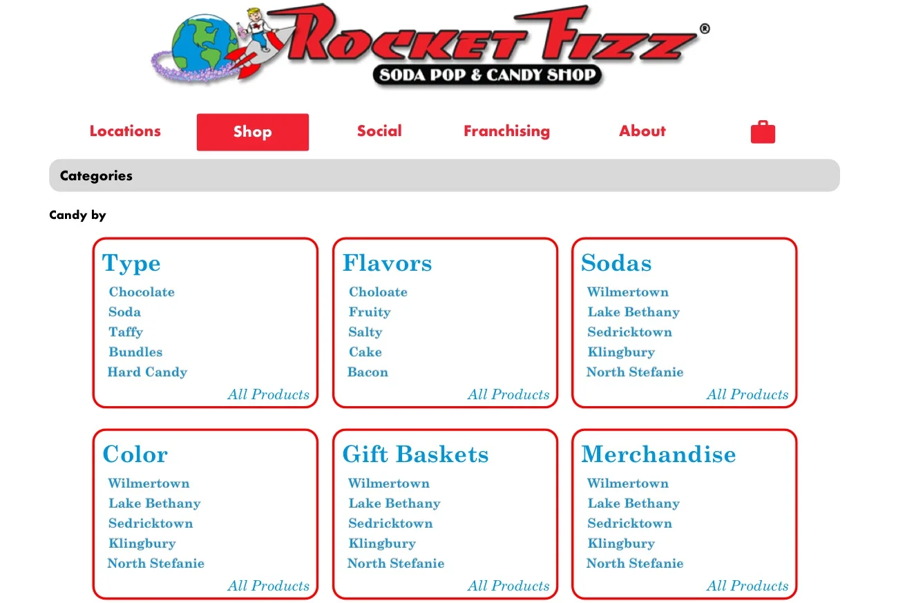
Rocket Fizz
No filtering options
“Soda” is the only subcategory
No search function
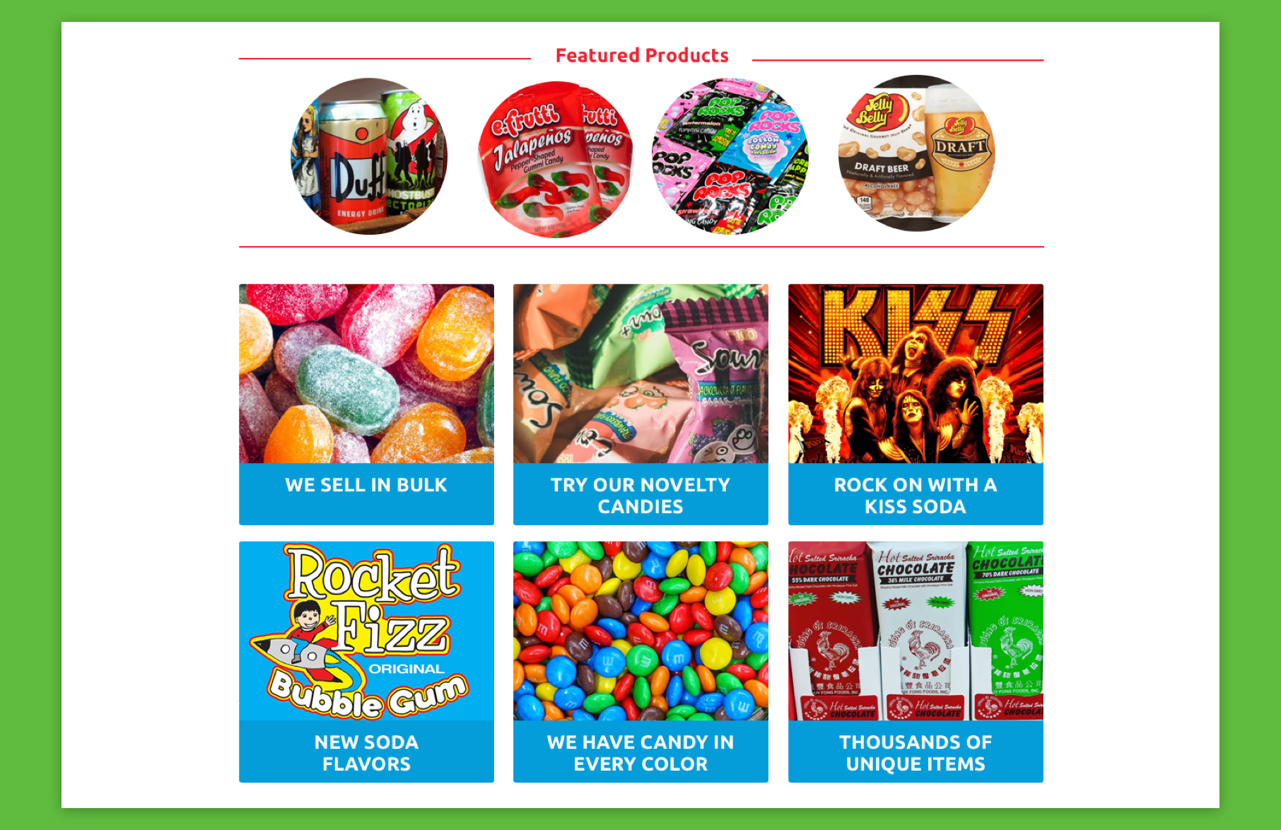
6 panels for featured products on the home page
Notification Bar
No promotions
Competitors
Extensive filtering options
Subcategories
Search options
Featured products
Reactive cart icon
Promotions
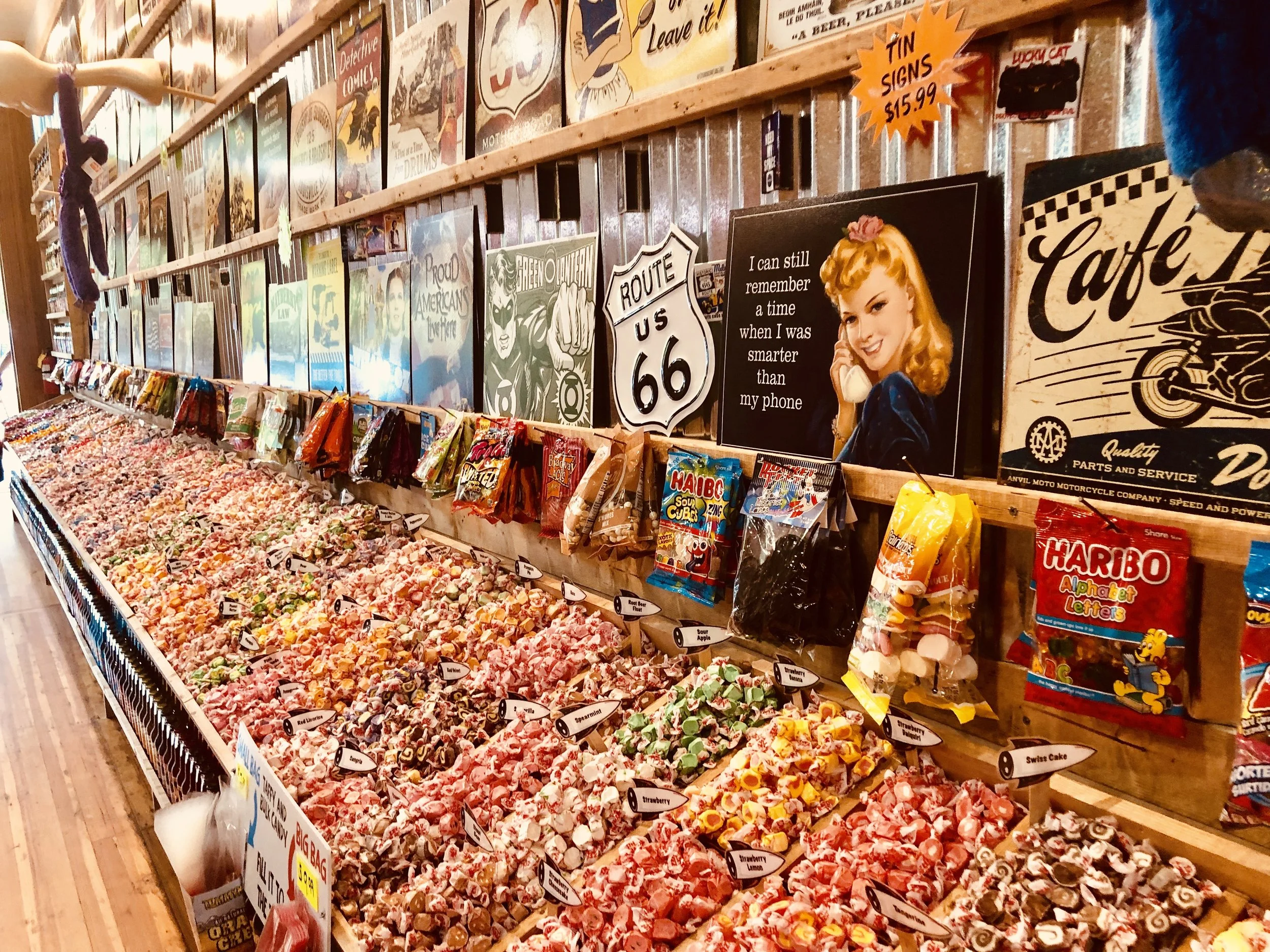
The website is not cohesive with the in-person experience.
The stores are designed to visually overwhelm users. When you arrive at the existing Rocket Fizz site, it leaves more to be desired. The sensory on the website needs to be up to par with the in-store experience.
Who shops here?
During my initial research I gained some insight on the types of customers who shop in person websites and order candy online.
Often customers buy candy impulsively, but there are a few who plan out purchases ahead of time.

Eric
24, Web Developer
Self proclaimed “workaholic”
Goals
Find a gift for his quirky friend
Wants to find something truly “unique”
Buy a gift in the least amount of time possible
Frustrations
Time
Doesn’t like face-to-face communication
No unique store near him
Goals
Find candy items in bulk
Have a “Instagram worthy” party
Wants the best deal
Frustrations
The amount of time it takes to drive to different stores for several items
Stores don’t sell most items in bulk
The effort to make everything cohesive

Andie
32, Event Planner
“I need it to be picture perfect”
No one wants to waste time, how can the site be seamless.
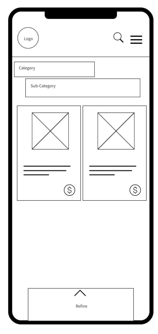
Home Wireframes
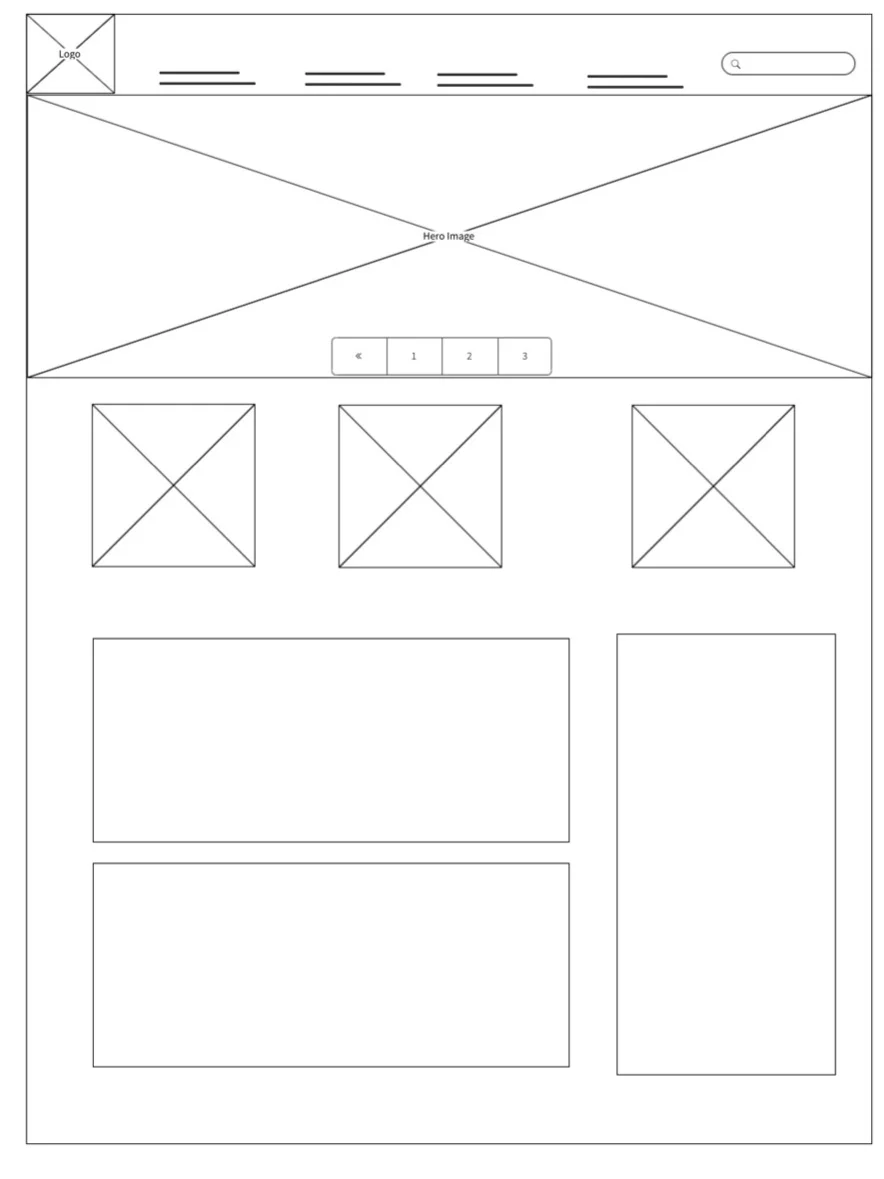
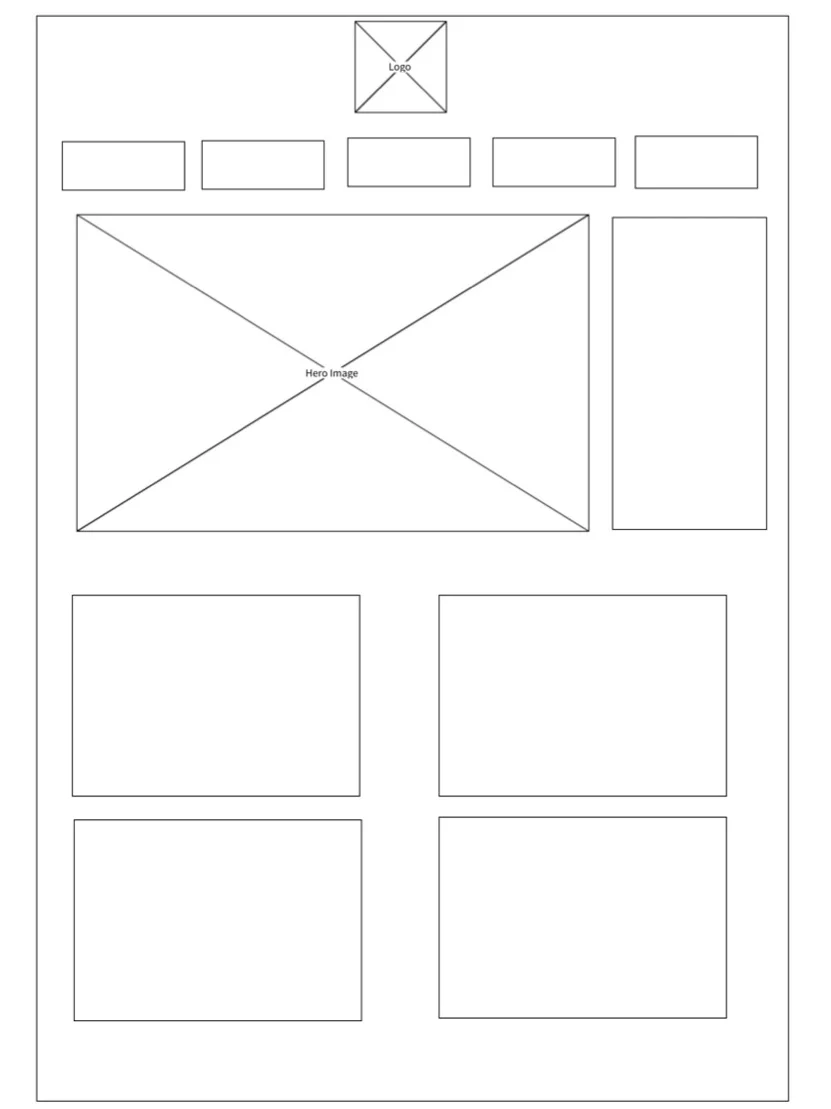
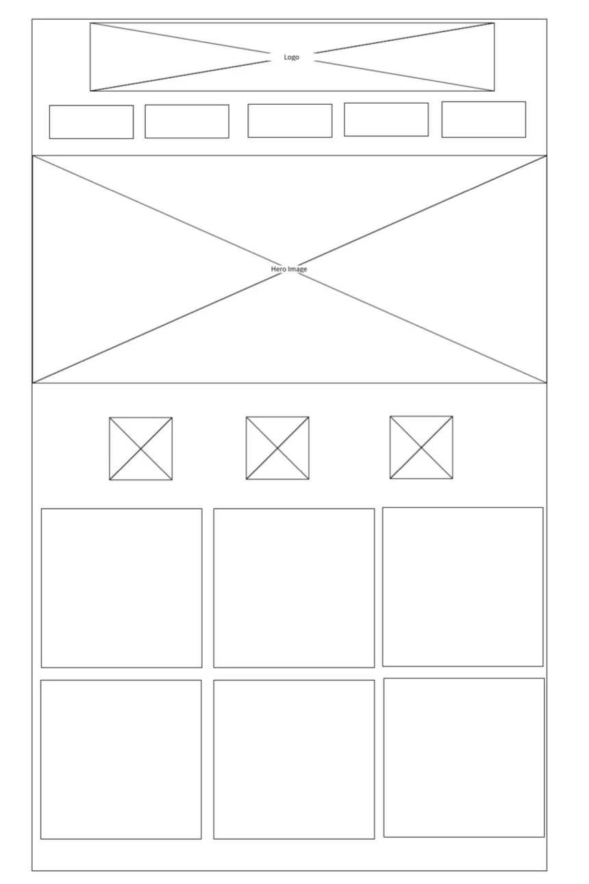
Navigation and Home Iterations
My first main task was redesigning the home page, and navigation. Based on user research, majority of customers have an idea of what they are looking for, and want to find it easily.
Candy can be organized in a million different ways, what is the most intuitive to the user?
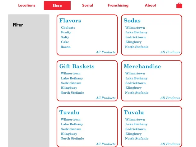

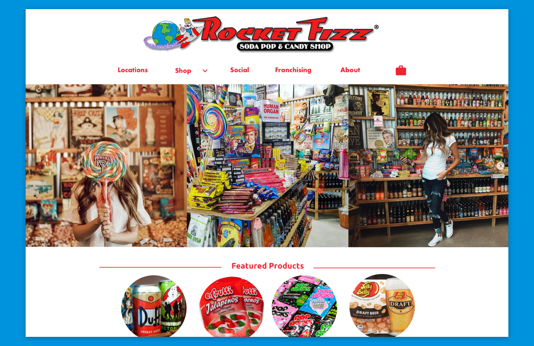
Home Page
Keep the charm, focus on the organizational and navigation.
User tested 4 users through a prototype in InVision. Each participant was prompted to purchase a soda.
Red is overwhelming - even though it is an integral part of RocketFizz’s brand is jarring to most users.
Text and image hierarchy are confusing and misleading - Often users were not sure what was the main focus of the screen, and were confused when navigating the site.
Users need an easier way to navigate - The initial navigation bar was confusing, and was overwhelming users
Inconsistency issues - ex. curvatures, text size
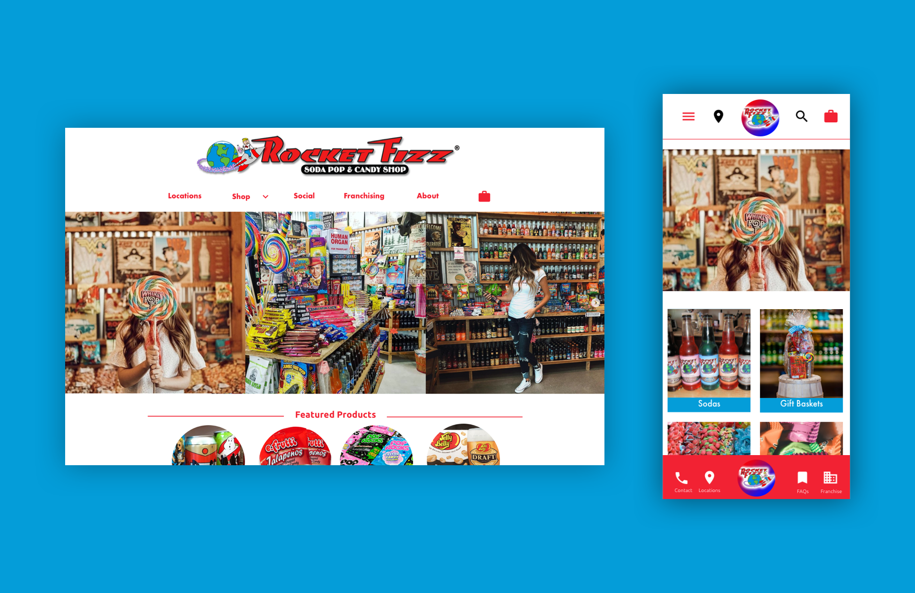
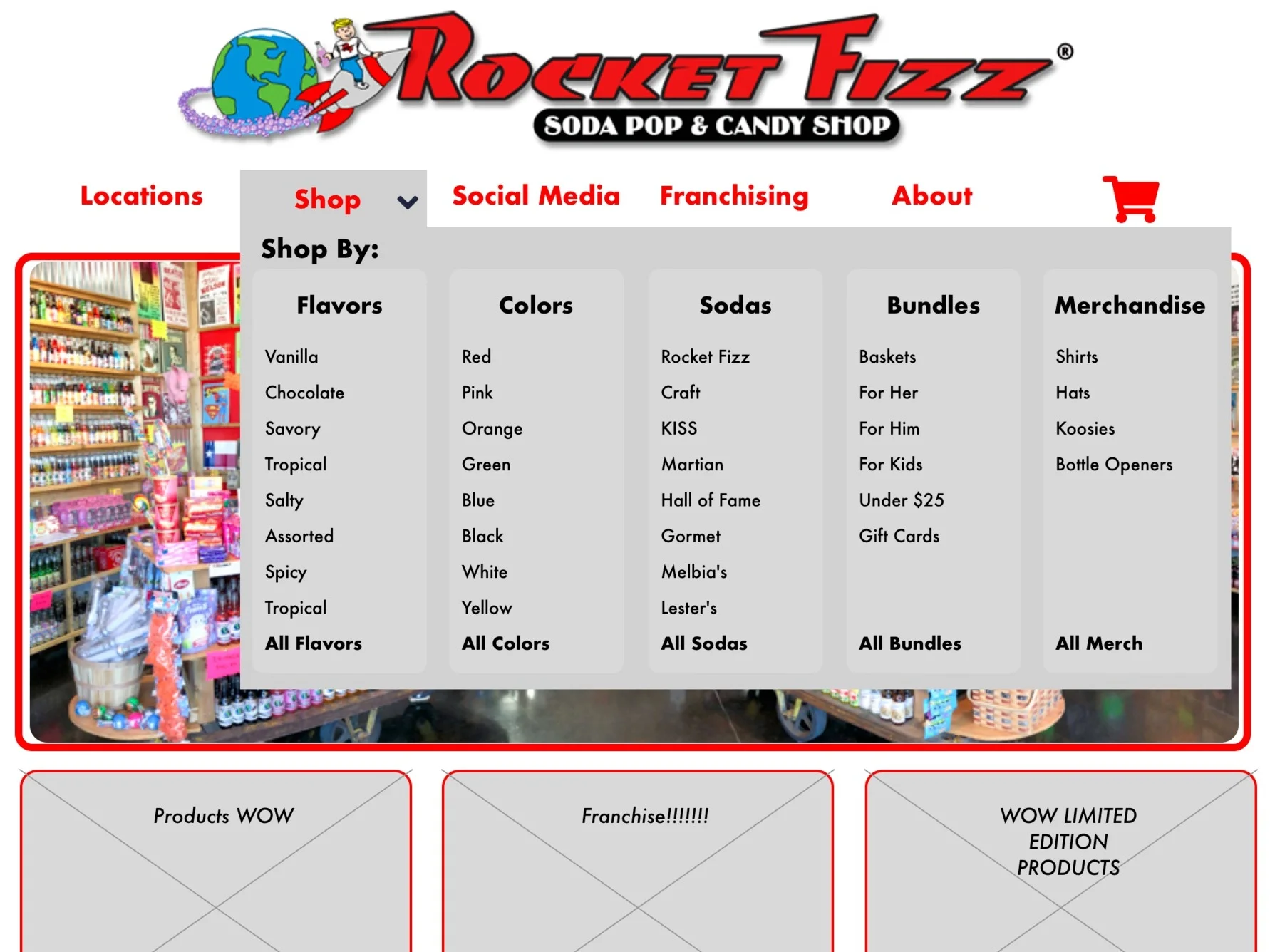
Rocket Fizz 2.0
Mobile Design
By taking my last Rocket Fizz screens to high-fidelity responsive designs, I was in a position where I had to go from desktop, to mobile, then back to desktop. This made it difficult considering the “Mobile First” design method. From my last project I had my layouts decided, and I had to determine what is the best way to condense everything yet having an efficient navigation system.
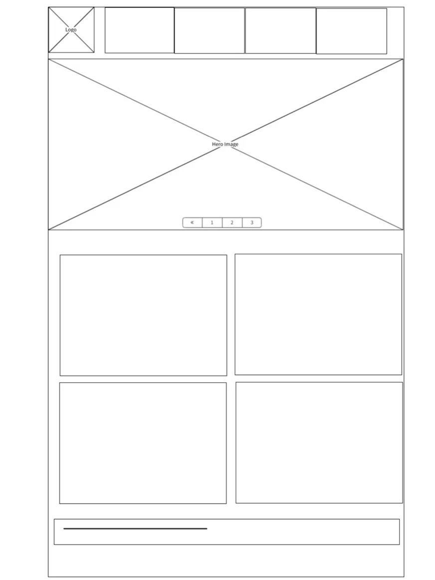
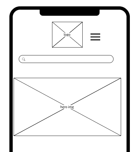
Home Wireframing — Mobile


Back to Competitive Analysis
Since I started designing in desktop, then switching over to mobile, it was a bit of a challenge to scale everything down. I sat down for another design studio and I ideated for a while, mainly focusing on the home page.
When researching sites, I compared mobile vs desktop designs and gathered that we have some typical patterns when it comes it an ecommerce site. I ended up going with the stacked design since it is the easiest to navigate and display information effectively. The rest of the mobile site is designed in the stacked format to keep it consistent throughout the whole interaction.


Lo-Fidelity to High Fidelity and User Testing
My timeline for desktop to mobile, was 1 week. I designed some basic wireframes and did some usability testing with 3 individuals.
Majority of the feedback was that the mobile version looked like any other ecommerce site. I stepped into Sketch to start raising the fidelity and I did run into a problem of colors. To refer back in my case study, red is Rocket Fizz’s main color, and red is a difficult color to integrate without overwhelming the users. I did several rounds of user testing to ensure that my usage of color was not disorienting.
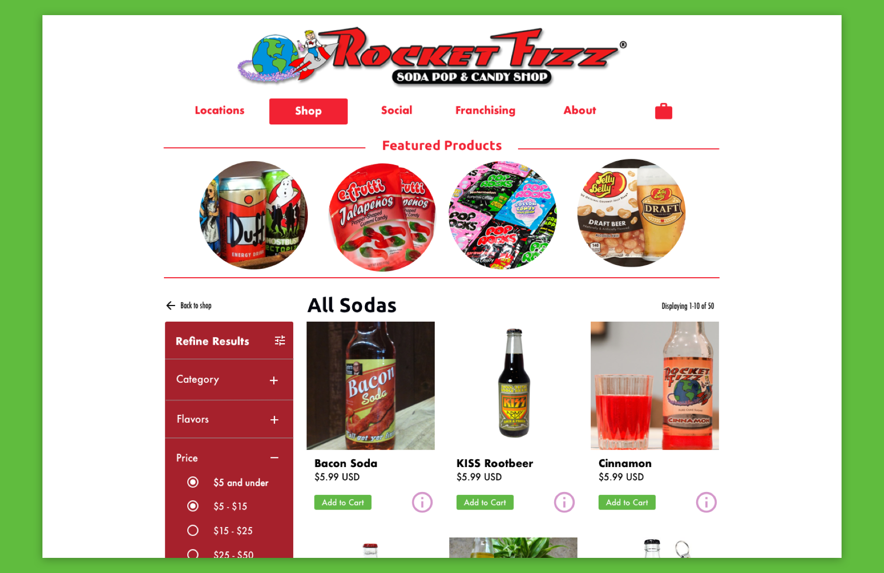
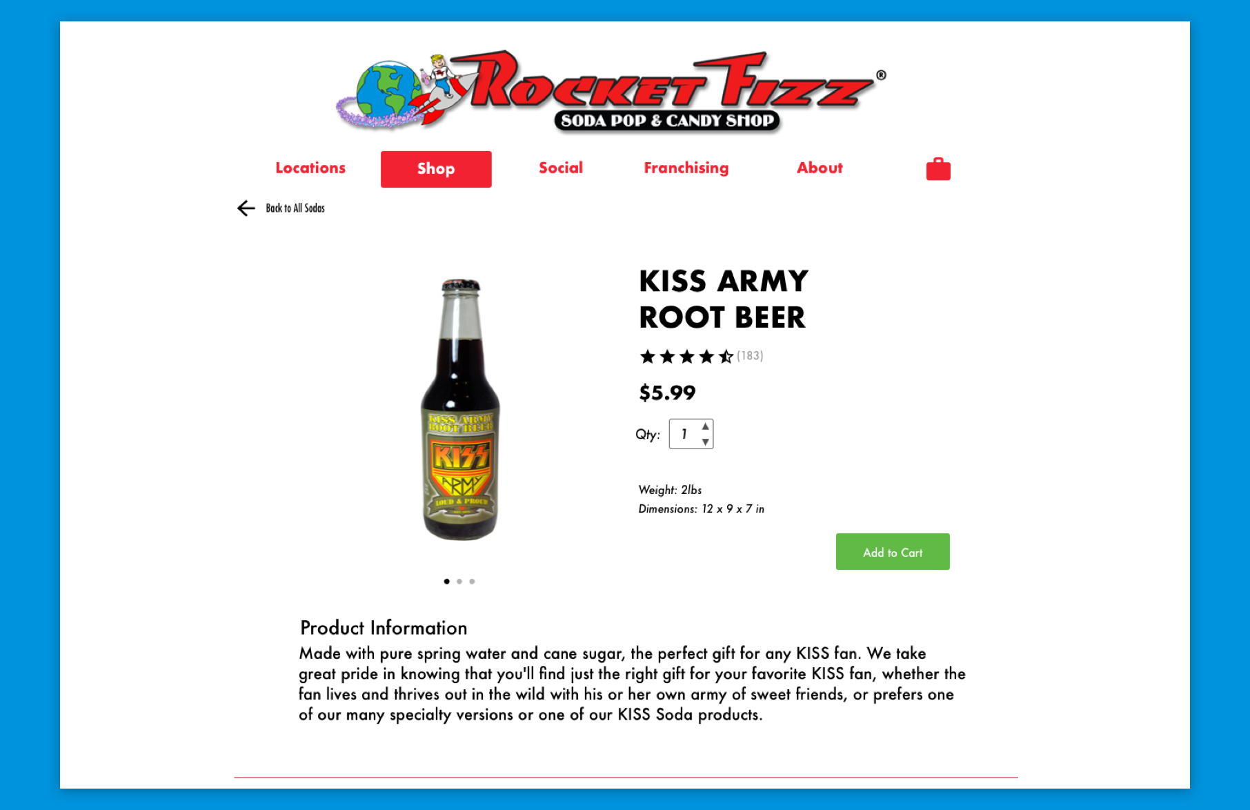
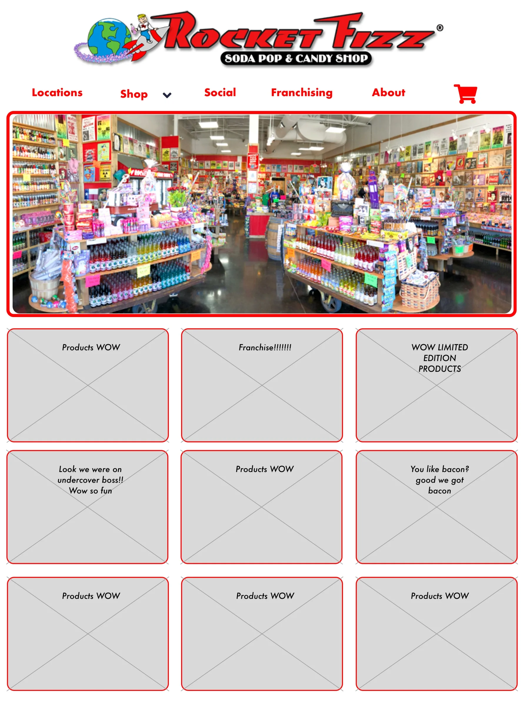
Final Designs

Design Breakdown
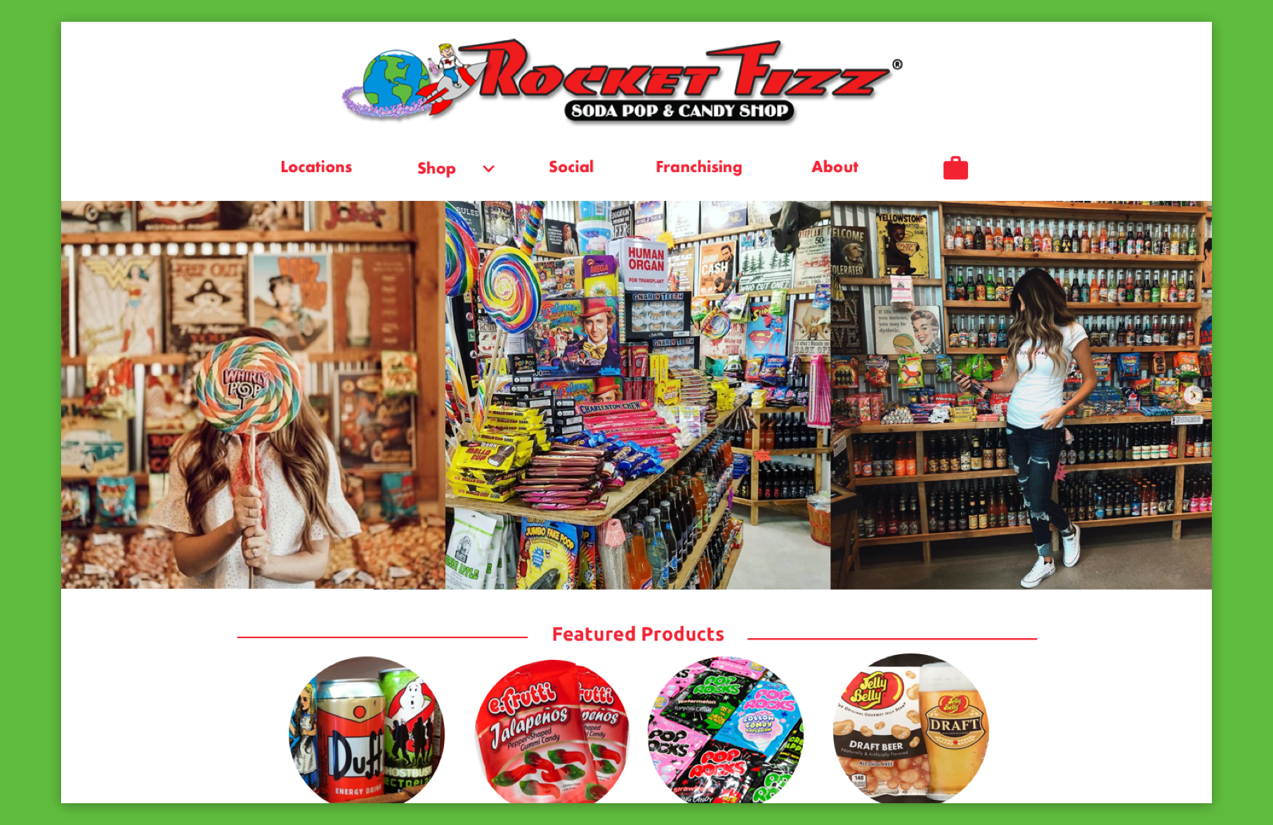
The current Rocket Fizz website is out of date, still advertising when they were on Undercover Boss in 2015. I created a homepage that was exciting, engaging, yet still informative. Rocket Fizz wants customers to feel overwhelmed when they walk into a brick and mortar shop, and I wanted to recreate that in a home page. The modules would be interchangeable, allowing to link to other pages and show new featured products or sodas.
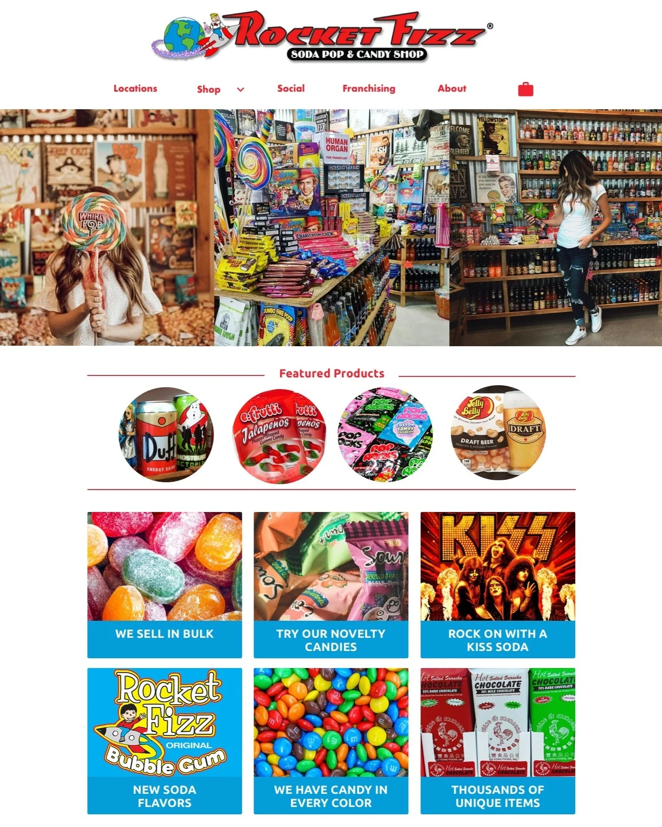

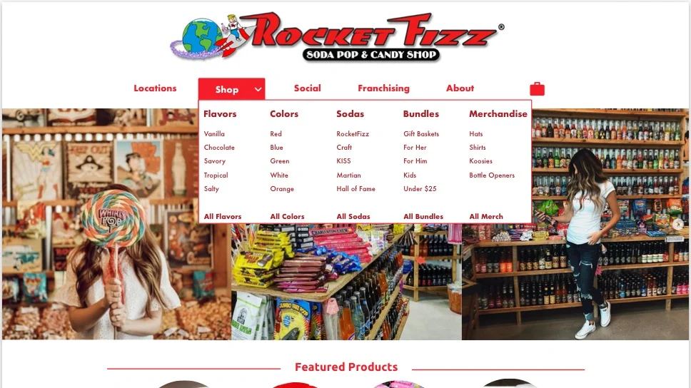
Drop Down
In the current website, the drop down navigation is not functional. Often leading to dead links or pdf pages, I wanted to create a way for Users to easily find a specific item, while still being able to explore the vast options Rocket Fizz has to offer.
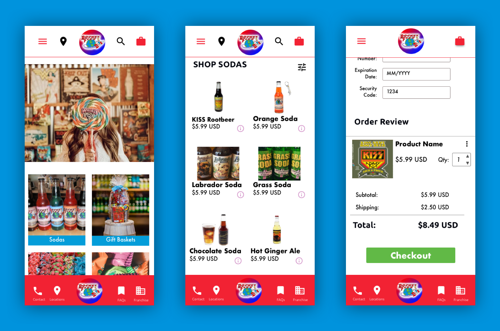
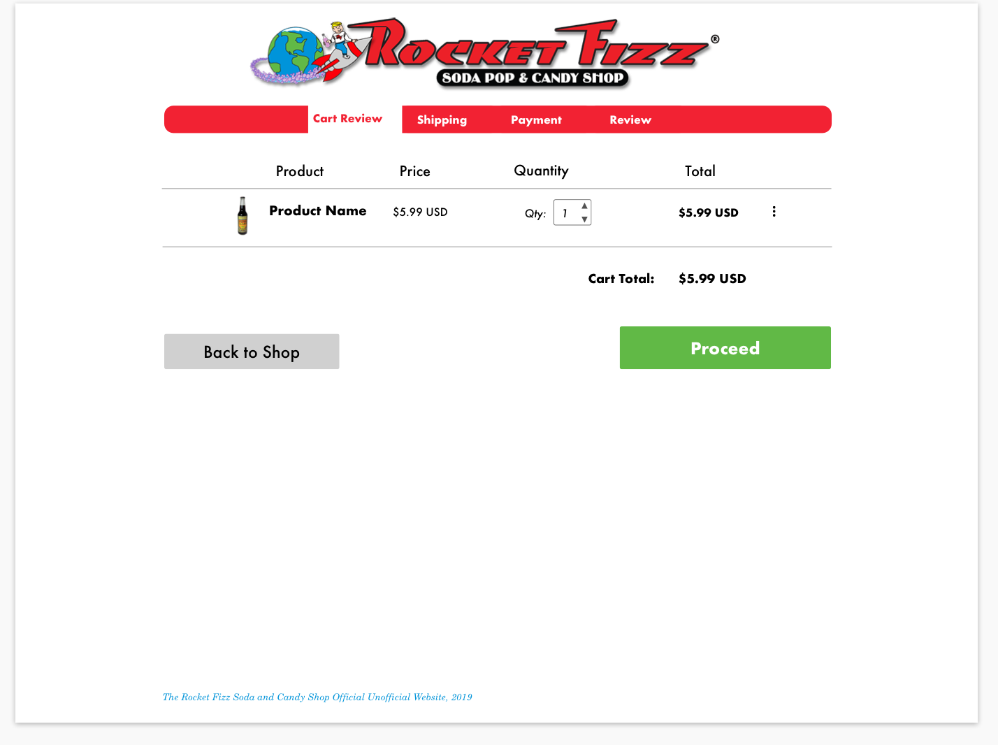
Mobile vs. Desktop — Checkout Process
During competitive analysis I researched several different methods for the checkout process. I initially designed my checkout process in desktop first and decided on multiple pages in order to not overwhelm the user during the process. However, once I switched over to mobile I quickly noticed I had not done enough research on checking out via mobile.
Since design is an iterative process, I took some time to research different methods for checking out on ecommerce sites via mobile. Several companies use the stacked method instead of different pages per step, and this heavily influenced my design decision.

See the Zeplin Style Guide

Reflection
Designing is an iterative cycle and always touch base to ensure you are meeting your users needs in every step of the process. Throughout this process I wanted to keep the integrity of the Rocket Fizz brand apparent in my design, red is a tough color to play with. I took inspiration from other brands where red is a primary color (such as Coca-cola and Budweiser) and researched how they incorporated red, while not being too overwhelming.
In this case study, my personas, Eric and Andie had an easier way of navigating around the site and it was an engaging experience. I was able to keep the authenticity of the Rocket Fizz brand while allowing for better navigation. My design modernizes the Rocket Fizz brand and gives them more of an internet presence by allowing them to have a ecommerce component .